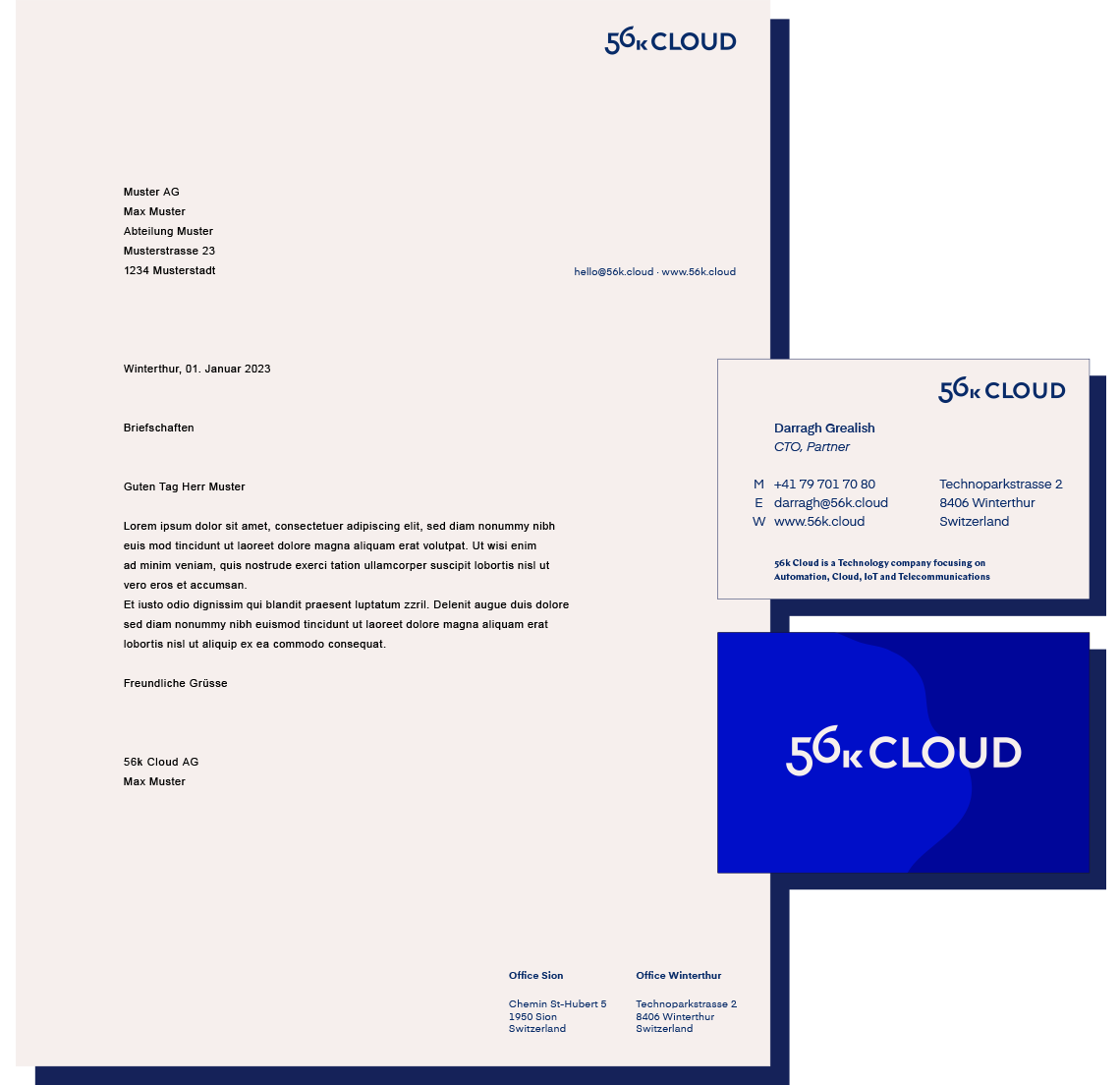
56k Cloud is a tech company specializing in cloud solutions. It was founded in 2008. I assisted in creating their first official logo and the conceptualization behind it. Over the years, we have collaborated on various projects, including many refinments of the logo.
The initial logo abstracted the word “cloud” as a galaxy or star cloud, symbolizing the ultimate cloud and forming the foundation of the brand story. Central to the brand is fostering communication with 56k’s clients and teaching them to effectively use the tech tools created for them. The refined version still preserves this essence, elegantly integrating the figures 5 and 6, which form the galaxy.
The first version of the logo helped establish the entire brand universe. We always knew that, at some point, we would need to simplify it – not only to ensure it works across all platforms but also to align with the trend of logo simplification, where only the essential elements remain.
Present version
Logo Mark
Graphic element
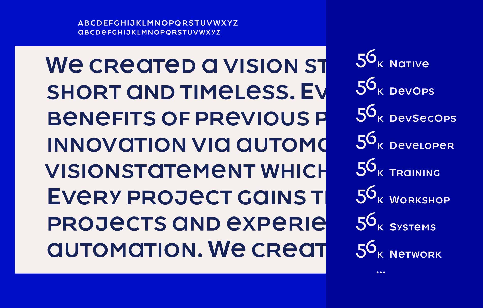
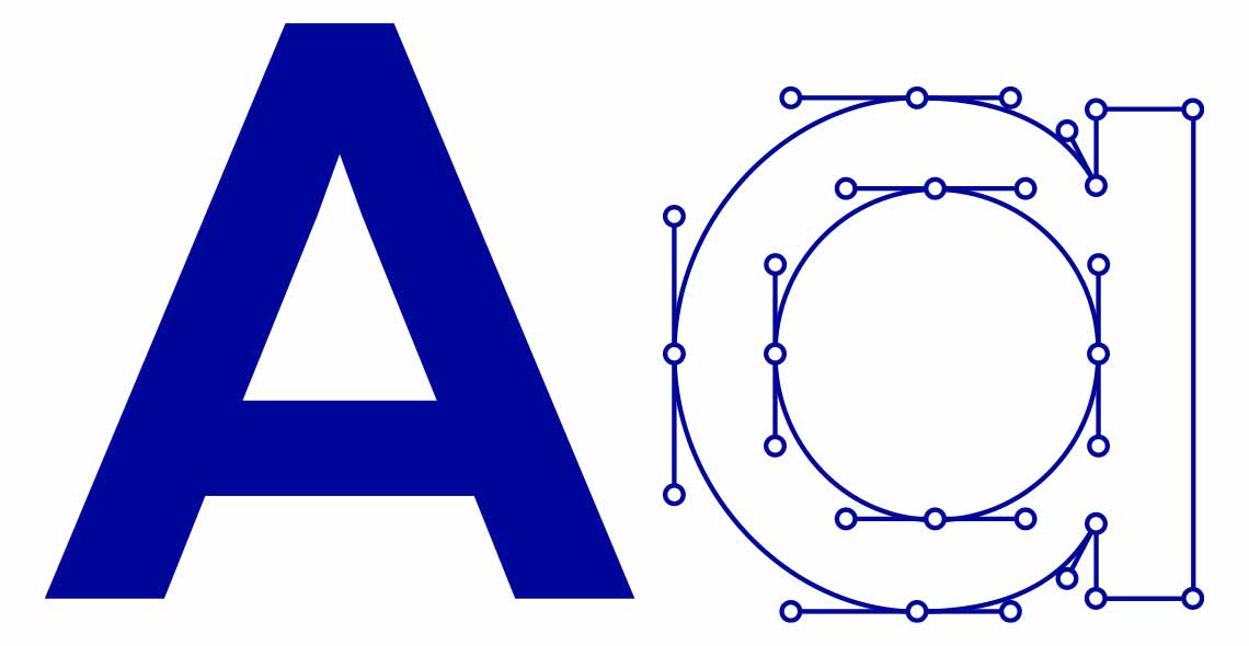
Typeface
A typeface matching the logo was designed for all sub-brands.
Icons
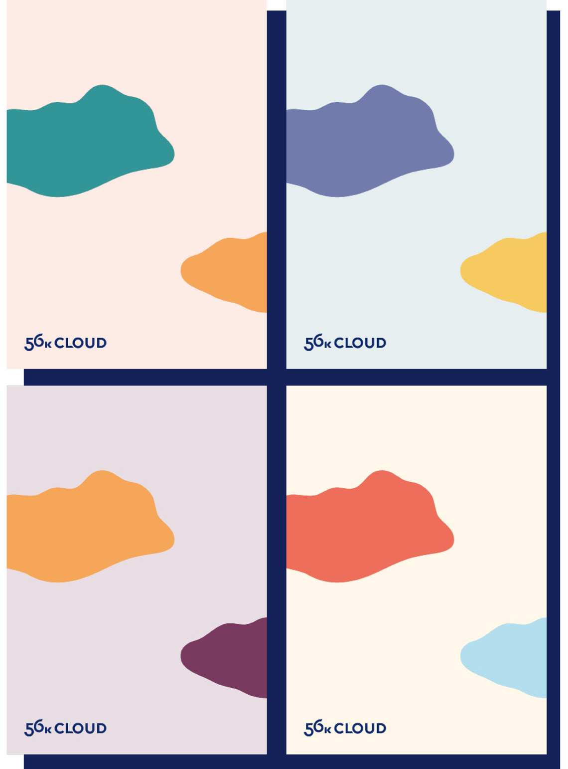
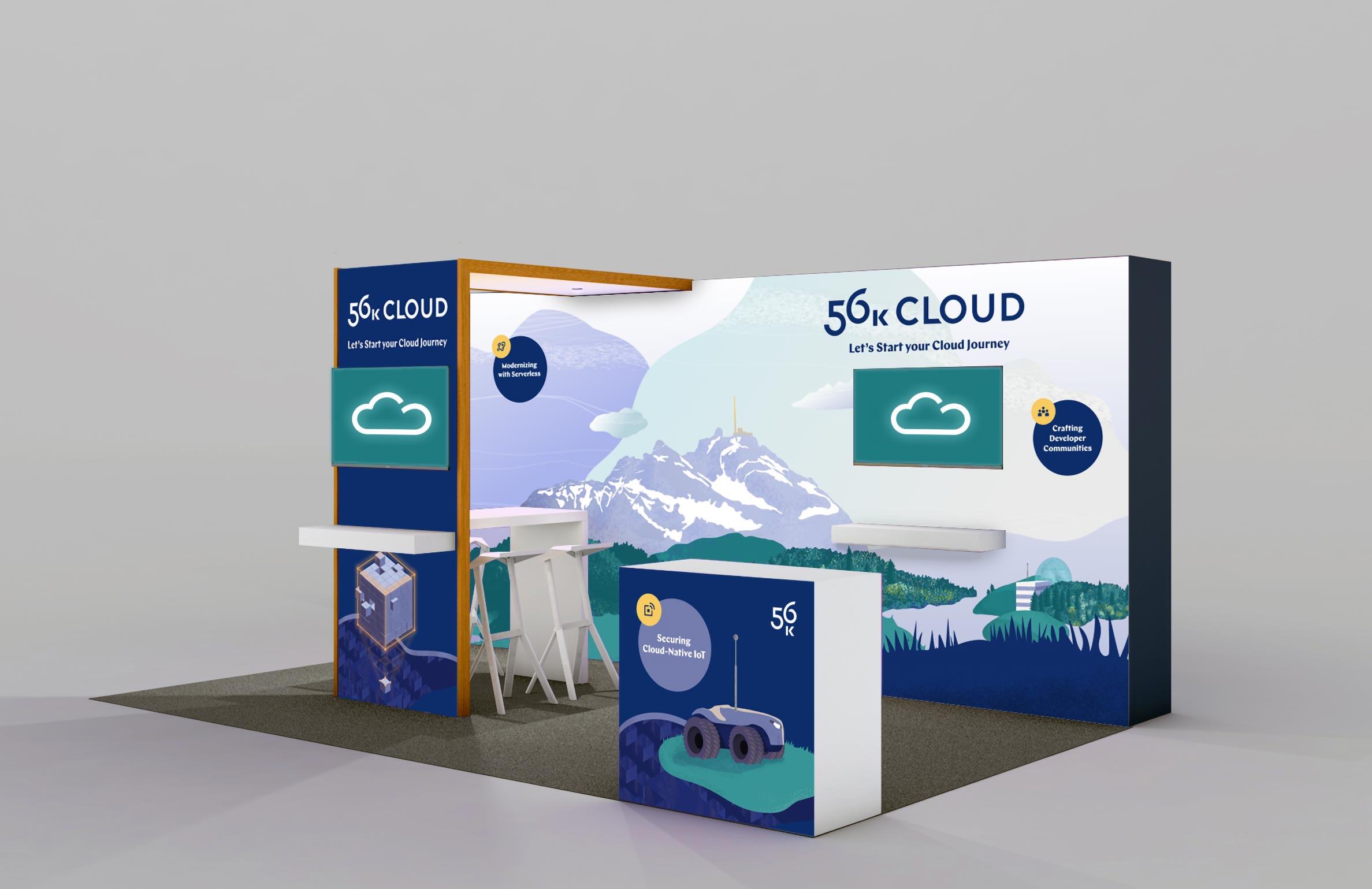
Cloud Concept
We created a visual concept where all elements are placed within separate cloud formations. Each element is independent and can be combined in various ways to create illustrations.