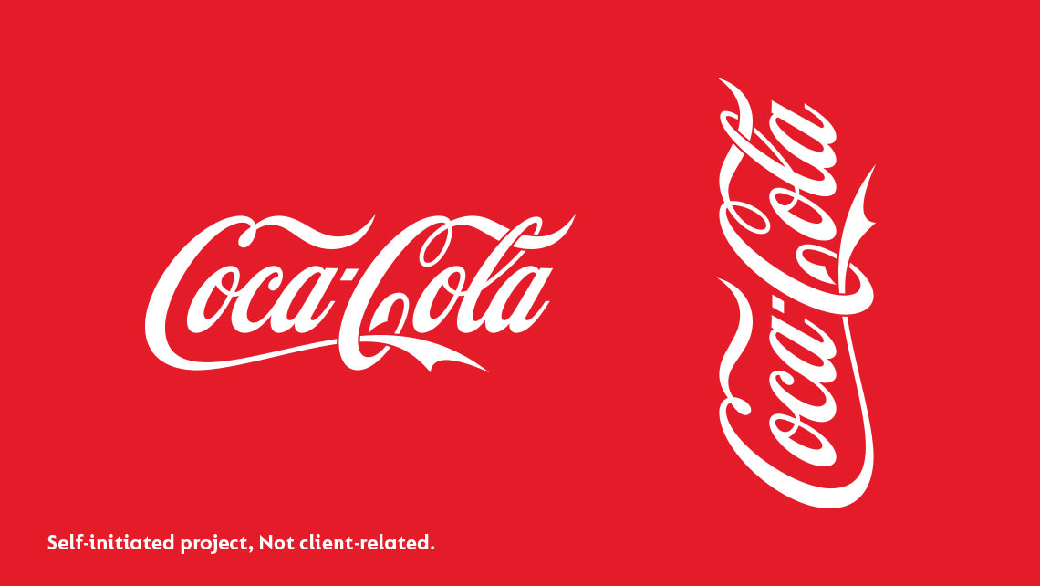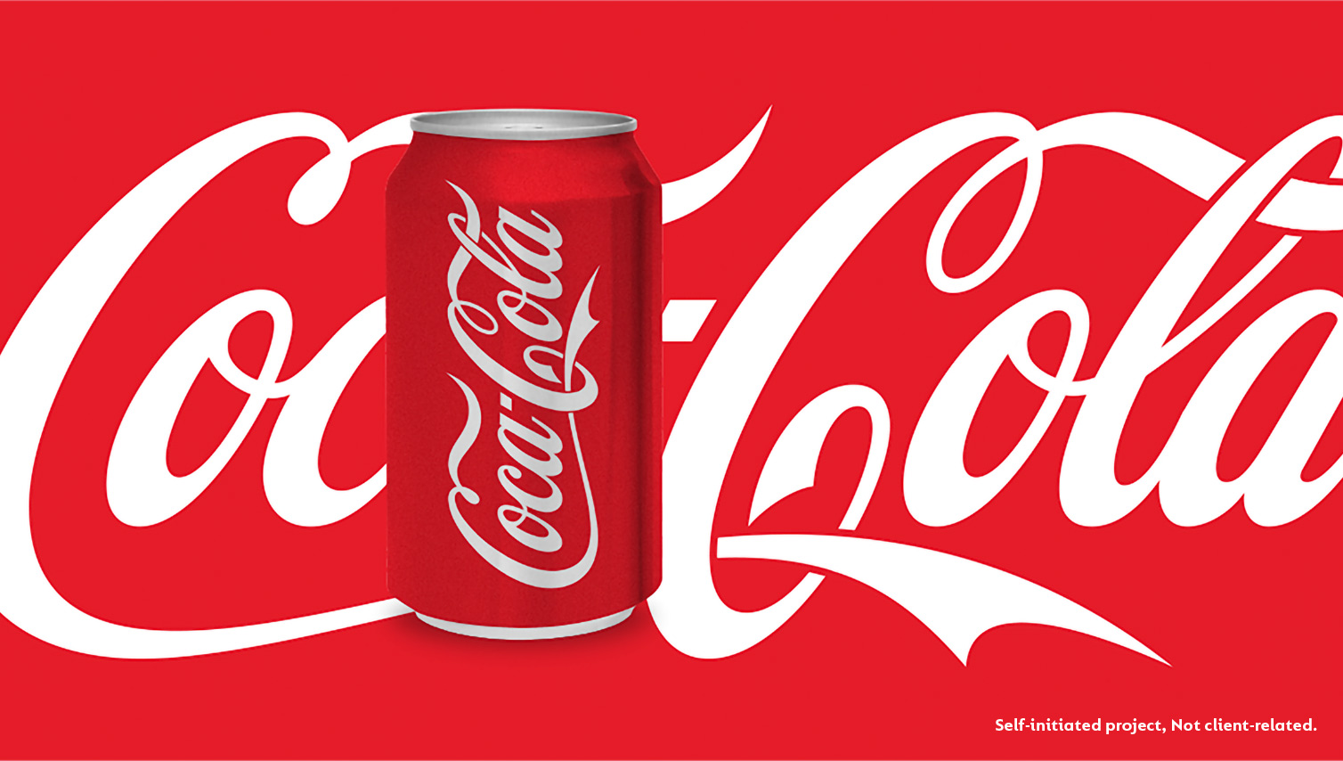
The Coca-Cola logo is iconic and one of the most recognizable brands worldwide. I wanted to learn from it by studying it's shapes. Redrawing the existing version would have been too straightforward, so I set myself the challenge of creating a reasonable version on a single baseline.
It was always a big mystery to me why the Coca-Cola logo needed to be on two different baselines and if it could also work on a single baseline. Even though the Coca-Cola logo started out with one baseline, I was only interested in the iconic logo we know from today and not the old versions of it. Trying to solve this task, I started by studying the existing logo and placing the first part ‘Coca’ on the same baseline as ‘Cola’. This definitely did not work.
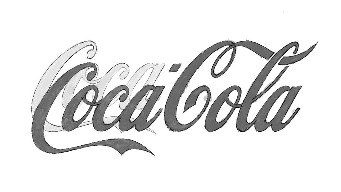
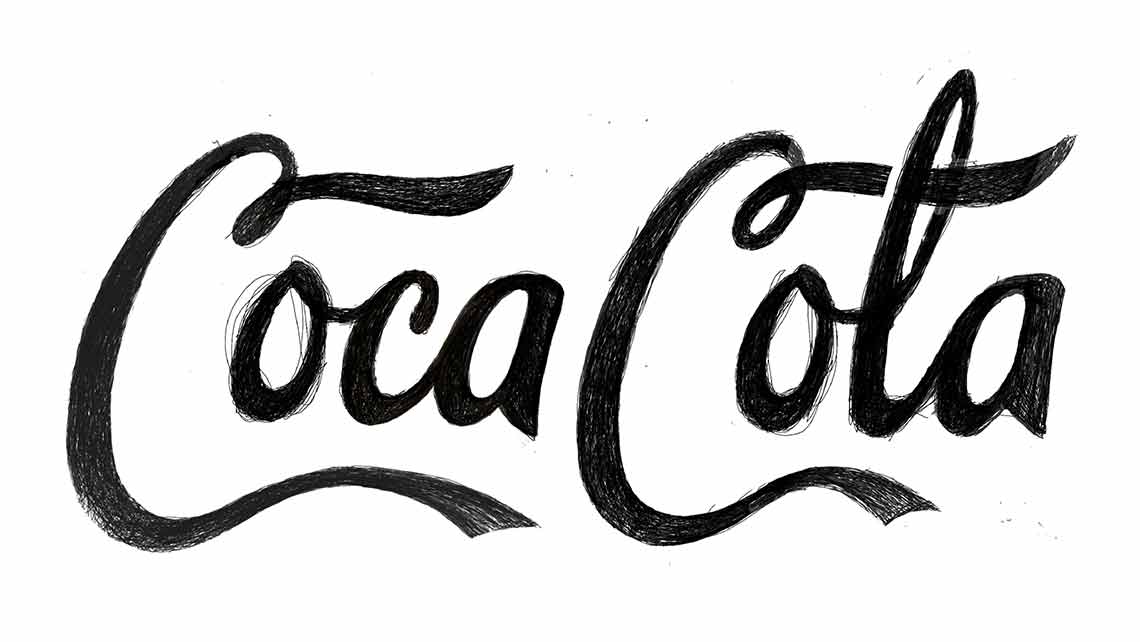
Beginning with free sketches and experimenting with new shapes in an attempt to solve the problem of a single baseline logo, I quickly realized the challenge this presented. No matter how I approached it, there would always be some form of compromise involved, giving me a better understanding of why they came up with the logo that they did. Also, I realized that if I didn’t want a monotonous-looking logo, I could not just repeat the same swooshes, top and bottom of the ‘C’s.
After many rounds of sketching, I came to the conclusion that the swoosh of the first ‘C’ had to go through the second ‘C,’ trying to compensate for some of the white space under ‘la.’ It couldn’t go all the way to the ‘a’; this didn’t look natural, so I aimed for the same curve and whitespace as the beginning of the curve under ‘oc.’ Even though the last ‘a’ has a bit [of space], this was the best compromise for my design.
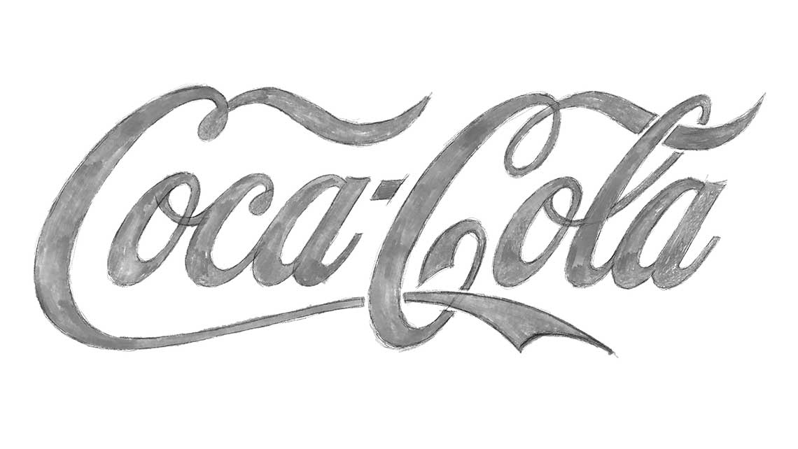
Final version of the single baseline logo
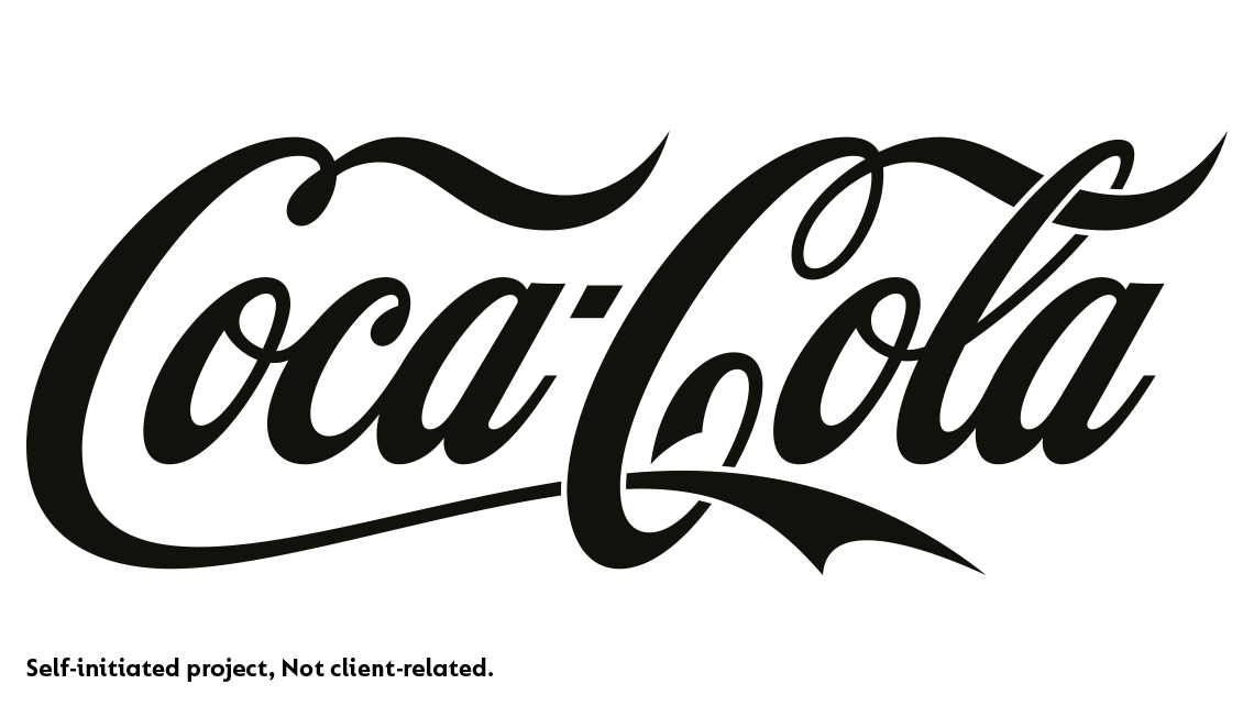
Existing Coca-Cola logo
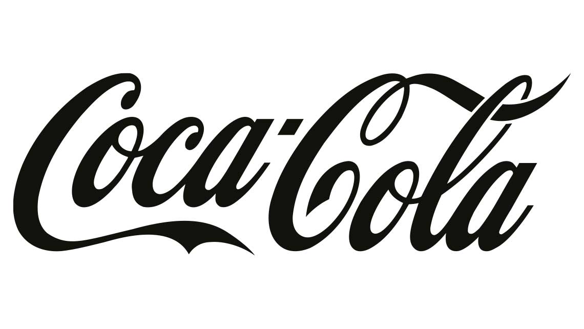
New one baseline Logo
Conclusion
The task was to determine if Coca-Cola’s logo could also function effectively within a single baseline solution. The conclusion drawn is that the logo indeed works well within a single baseline and could serve effectively as a secondary or responsive logo alongside the original. Additionally, the logo presents an intriguing dynamic when placed vertically, resembling the shape of a Coke bottle.
