A personal redesign of the renowned Carlsberg logo
“I grew up in Copenhagen, the hometown of Carlsberg. For me, Carlsberg’s logo is Denmark’s single most important historic logo.”

In 2018, Carlsberg’s logo was redesigned, and my initial reaction was “yes,” this change was much needed. The previous version dated back to 1971 and no longer had a contemporary appearance. Despite my admiration for the new logo, there were certain design decisions with which I disagreed.
This also prompted me to delve into the original 1904 logo by Thorvald Bindesbøll, initiating my study.
Carlsberg’s (new) logo from 2018
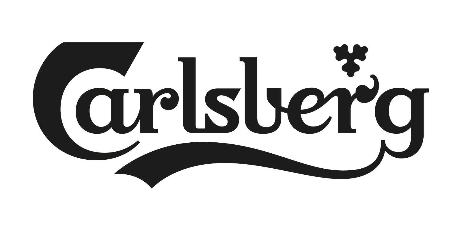
First, I studied the new Carlsberg logo from 2018. One aspect especially caught my eye – the curved ending of the ribbon swash tail. This reminded me of Coca-Cola’s logo and appeared inconsistent with the rest of the design. Additionally, due to the tightly spaced letters, the gaps created by the very wide “r’s” are disproportionately large, disrupting the flow of the reading. Furthermore, I feel that the “s” lacks sufficient space to breathe and looks squished together. It is obvious that the designer aimed to create a logo suitable for display in large sizes with lots of details.
Bindesbøll’s Label from 1904
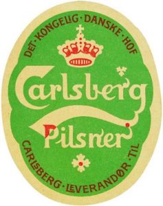
The next step was to study the very beautiful label drawn by Thorvald Bindesbøll back in 1904. I carefully copied the logo by redrawing it from the label to better understand the letter shapes and construction of the logo. Details in the typography show how Bindesbøll cared about the spacing of the letters by creating interesting ligatures like the “LI,” “LS,” and “LE” here documented on his Carlsberg label from 1904. In “DET,” he makes the “DE” smaller than the other capital letters, which I personally think is not the best solution, but it still shows that he cared a lot about spacing and the relationship between the letters.
Redrawing of Mr. Bindesbøll’s logo from 1904
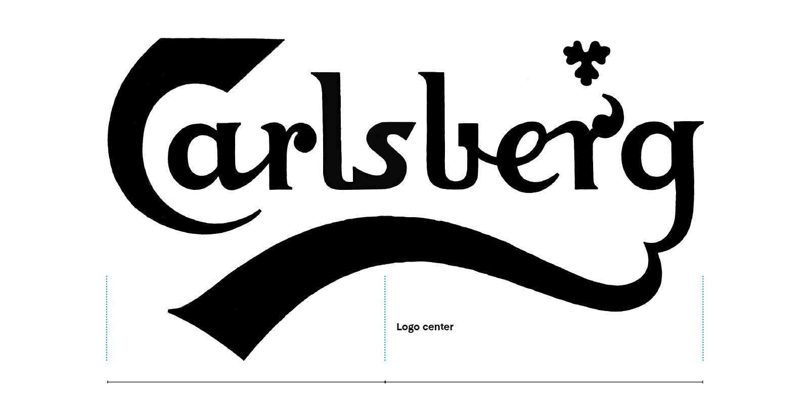
Design princeples
After carefully redrawing the logo from the label, it became much easier to study Mr. Bindesbøll’s work, rhythm, and logo intentions. The first thing that caught my eye was that his letters are very widely spaced, allowing for letter connections while addressing the common issue of the “r” creating a large gap. He also repeated letter shapes in a way that transformed this complex logo into a visually cohesive design. An example of this is how the ending tail of “a” is repeated at the beginning of the second “r.”
An interesting design feature is how the second “r” goes up instead of down, enabling tighter spacing between the “r” and the next letter, and giving the logo a playful twist.
He also achieved a clear balance in the logo with a central emphasis on the “s,” supported by the top of the ribbon swash curve. Additionally, he made the “s” darker (with less contrast) to emphasize this point. The balance here was very interesting. The heaviest letterforms (the large “C” and the ending of the ribbon swash) were all on the left side of the logo, but by placing the tipping point at the “s” (which is more to the left and not in the center), he created a new balance where the largest part of the logo was on the right side – achieving a balanced composition close to the golden ratio. It is also interesting that he placed the little hop leaf on top of the “r,” probably also to enhance the balance of the logo.
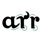
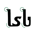
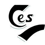
Bindesbøll knew that to succeed with such a complex design like the Carlsberg logo, he had to repeat vital shapes and letterforms at least two times; otherwise, some of the letters would appear like strange objects not belonging to the design.
Carlsberg logo from 1971
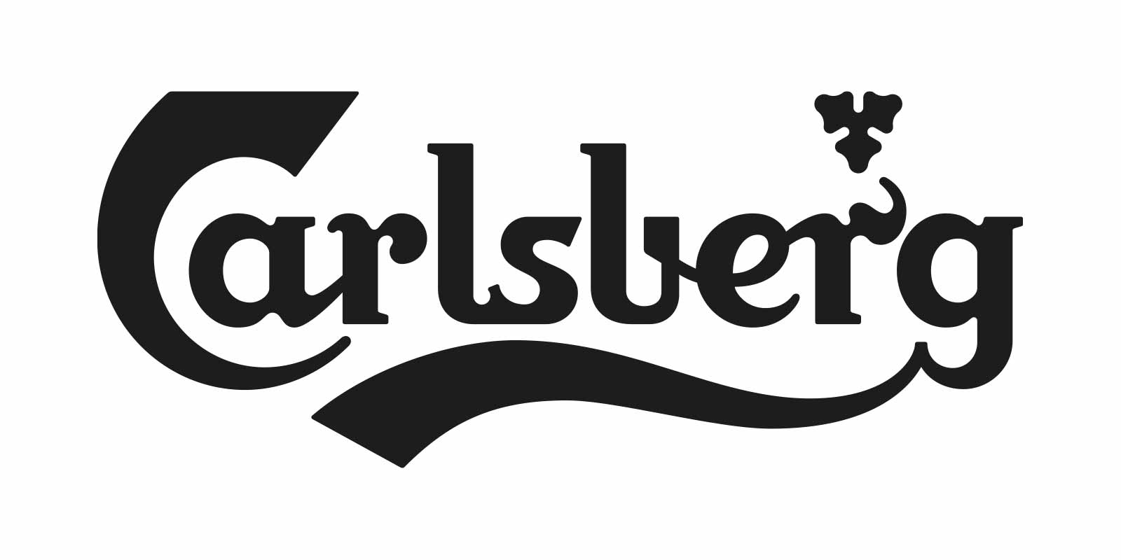
Of course, I also had to study the Carlsberg logo from 1971, the logo I grew up with and have known since childhood. It is a much sturdier logo, designed to resonate with the typical man of that era. Besides being bolder, it also features sturdier slab serifs, and there is added contrast to the “s”. The overall appearance is more rounded and constructed.
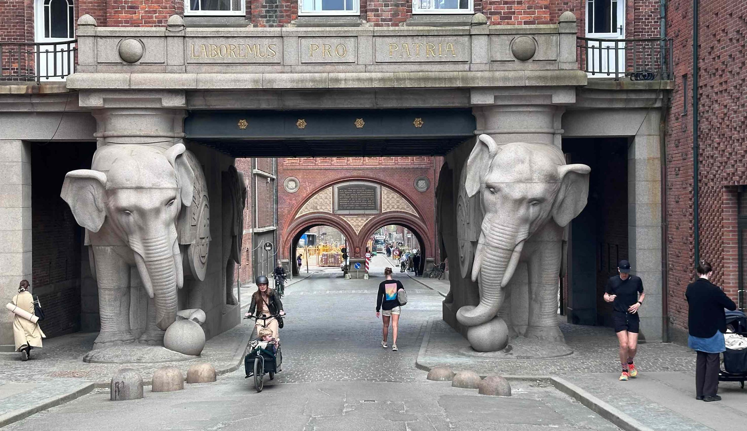
Even though there is no real proof, I am convinced that Mr. Bindesbøll imbued the Carlsberg logo with hidden symbols.

At the entrance of the old Carlsberg, there are large elephant sculptures that might have inspired Mr. Bindesbøll for his logo. Carlsberg’s official website, under the history section, indicates that the “C” could symbolize an elephant tusk. However, I personally am inclined to interpret it as an elephant trunk (with ears).

On Carlsberg’s website, also within the history section, they mentioned the possibility of the serifs resembling elephant feet, a notion that I find both captivating and credible, particularly when considering the significant symbolism behind the “C”.

In my personal opinion, Mr. Bindesbøll also drew inspiration from Danish prehistoric eras and incorporated symbolism representing the Viking era into his logo. The “s” bears, a striking resemblance to a dragon head on a Viking ship.

Wenn flipping the ribbon swash upside down this could indeed resemble a Viking drinking horn, which makes sense considering its association with beer.
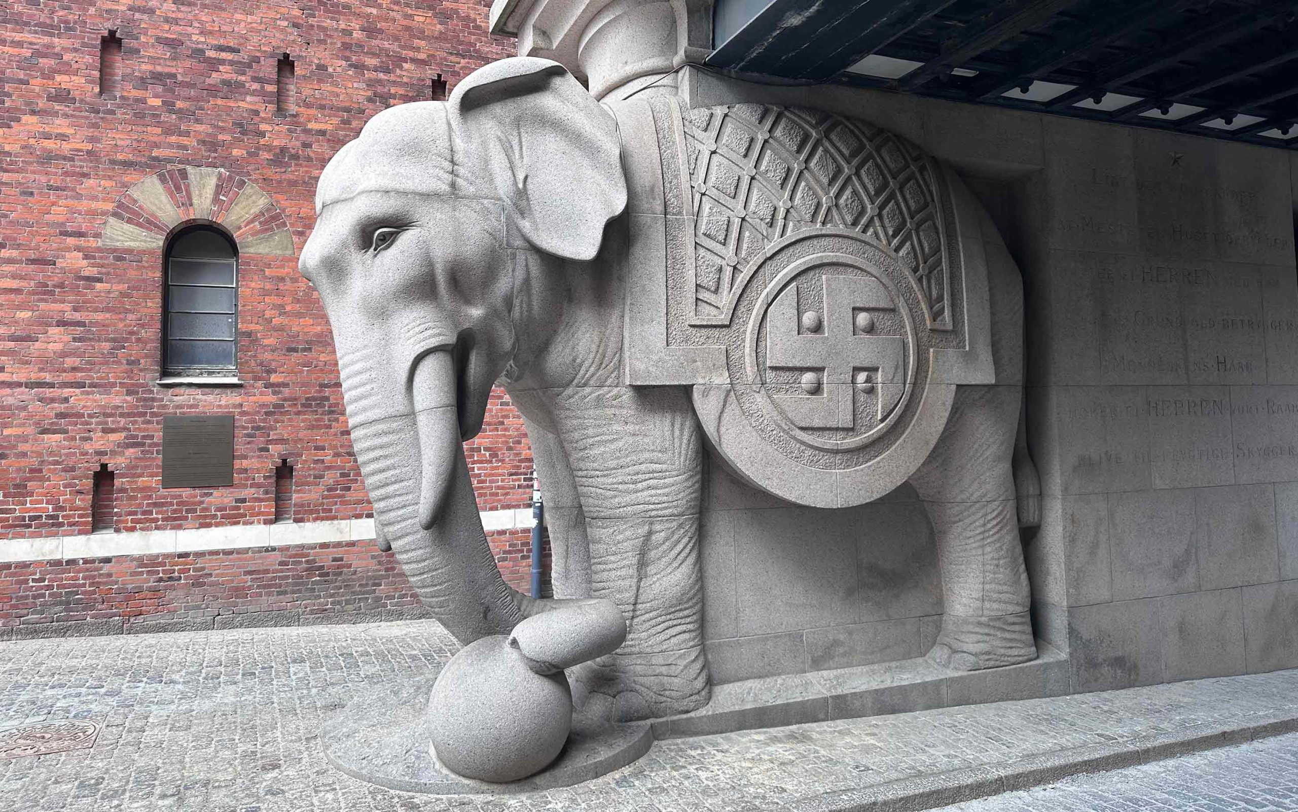
Before Carlsberg got its logo, they tended to use the sun symbol as their logo.

First sketches
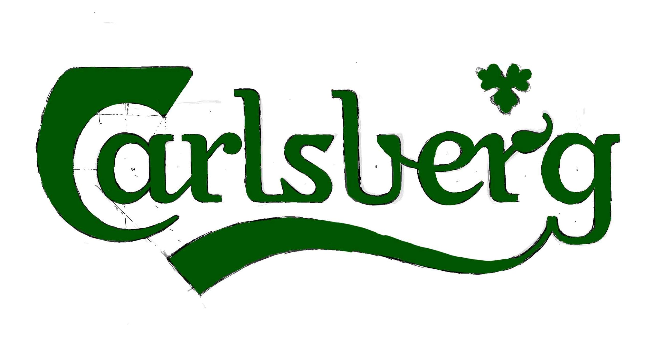
The first sketch was made entirely from memory of. I allowed myself to design freely in this process and to come up with new shapes and ideas. I even tried to round the sharp edge of the “C” to see how this would work.
Digital
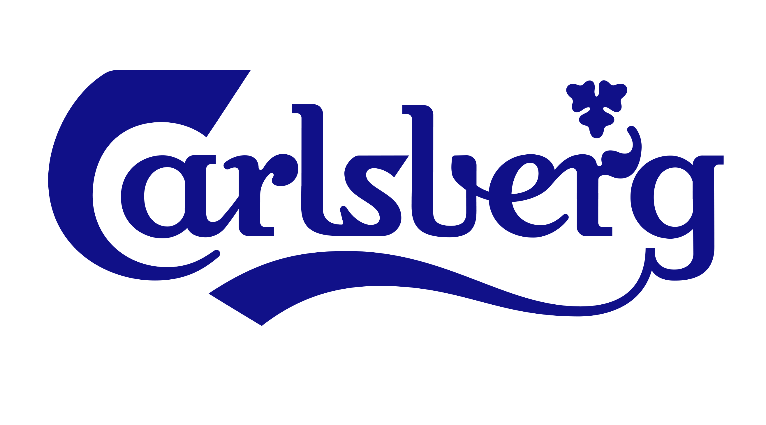
Early in the process, I decided to go digital with vector graphics. The logo task was not about creating something entirely new but finding the right style, where small and precise details are crucial, and vector lines offer greater precision.
After the first sketching process, it became clear to me that the Carlsberg logo is a complex design with many facets, and I needed to make some design decisions on which direction to follow.
To do this, I went back to study the three existing Carlsberg logos. In the 1970s, the logo became more constructed, and the newest one from 2018 is again more handwritten but with a different writing tool. The first logo from Bindesbøll combines elements of both approaches, generally appearing more handwritten, but with distinct differences in character such as the “a” resembling penmanship and the a bit more constructed shape of the “g,” which likely inspired the 1971 logo version.
Secondly, I tried to understand what tool Mr. Bindesbøll intended to have used. To me, it looks like a classic broad-nib pen tool but with a transition because the letter shapes don’t entirely follow the writing rules of a broad-nib pen. The newest logo from 2018 looks like it was made with a pointed nib pen, which is a different tool and therefore not historically correct. The logo from the 1970s is more difficult to define but may have used different pens to accomplish its design.
1904
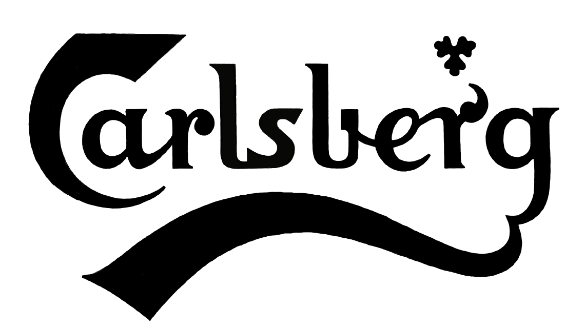
1971

2018

For me, it was important to take it back to its roots and achieve the original look again, but of course with a contemporary appearance. I also drew inspiration from the constructed look created in the 70s because this approach made it appear cleaner and worked well even in small sizes.
The second sketching phase
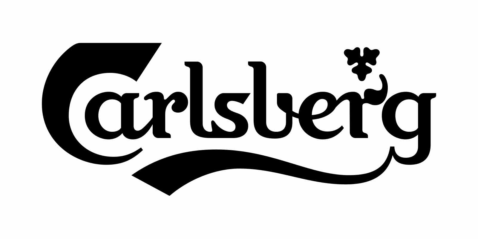
In the second sketching phase, I experimented with different slab serif shapes inspired by the 70s version, but I was not satisfied with the results. I ended up going back to study the serifs again.
A study of the serifs

1904

1971

2018
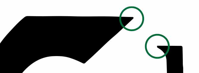
After thoroughly studying all versions, I found my direction. I decided to keep Bindesbøll’s original, classic, pointy serifs, which fit perfectly with the sharp edges of the large “C.” These serifs were changed in 1971 to slab serifs, but the original serifs are in line with the logo concept created by Bindesbøll and should therefore be preserved.
The second “r”

1904

1971

2018
The second “r” was a real challenge because I didn’t like any of the previous designs, including the original. If you look closely at the original design, it’s clear that it has nothing to do with plant shapes but rather something typographic, like an upside-down comma glued on a stick. The last design from 2018 it has become a leaf, and even though I think they went too far, I decided to also go with an organic shape because this is what fits my version best.

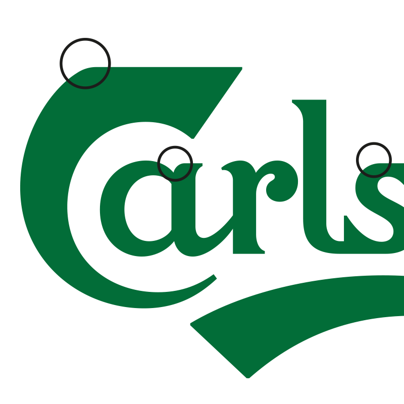
I decided to keep the rounding on the left side of the “C” because it fit perfectly with the rounding I created on the “a and g” and also applied to the “s.” However, the main reason is that it looks smoother and less abrupt than the original design.
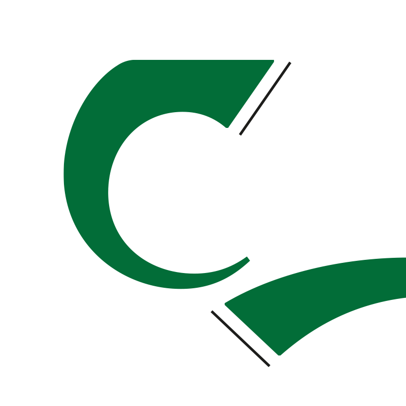
An important detail to bring back, which totally disappeared in the 2018 version, was how the ending of the “C” and the ending of the swash ribbon form an arrow shape if you connect the lines. This ending also ensures that the shapes are related to each other and therefore remain true to Bindesbøll’s repetition system.
Final logo
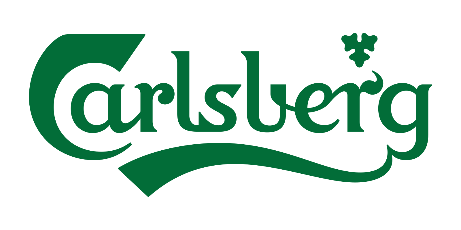
Self-initiated project, Not client-related.
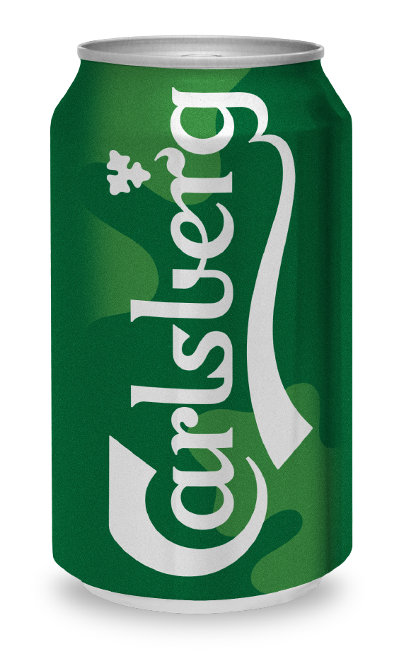
After an amazing design process and many discussions with the late Mr. Bindesbøll about how we could create a contemporary version of his beautiful logo, we came up with this pleasing version. I believe it stays true to both history and the present time we are living in.

ØL means beer in Danish
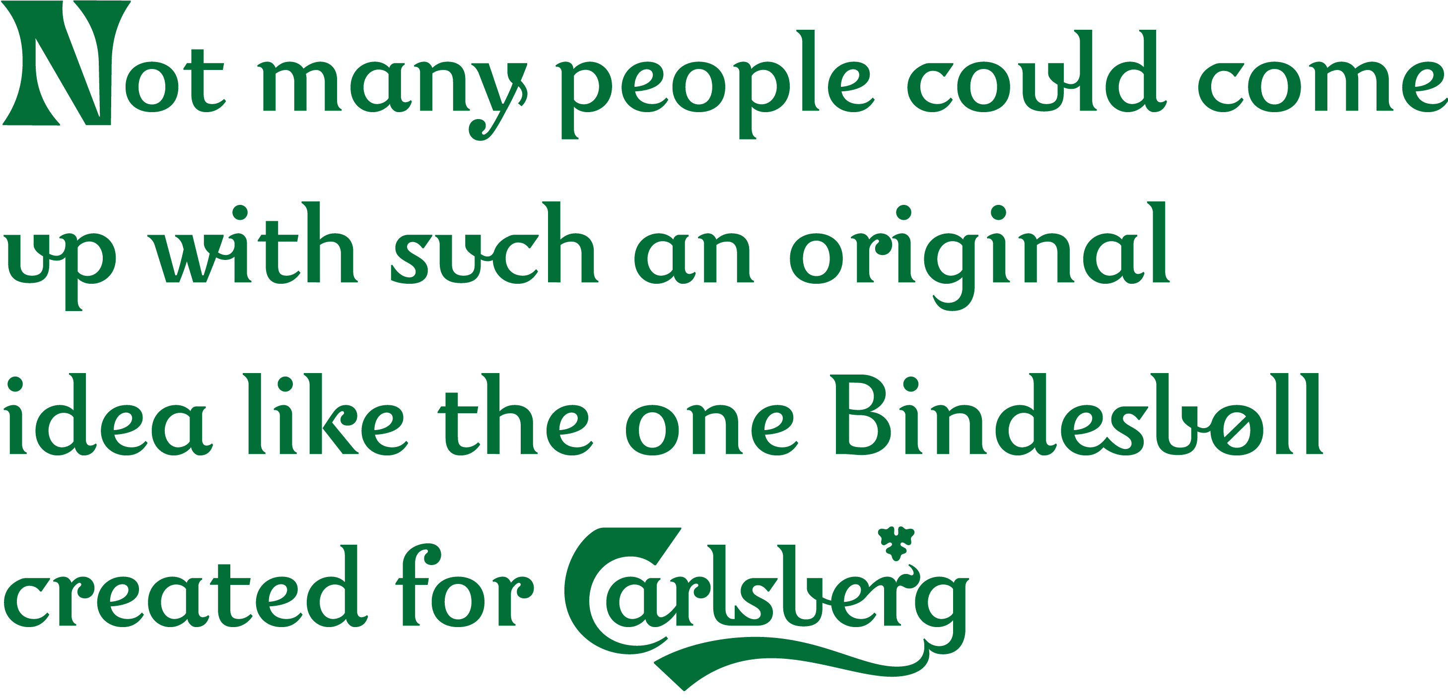
Self-initiated project, Not client-related.
I created this Carlsberg typeface based on the logo. I did this to check the shapes in other combinations with each other. From the beginning, I had a theory that his letters would not work well as a typeface. Some of the letters I had to adjust quite a bit to make them look even, like the very narrow “b,” which also became the “u” shape, and the “e,” which was also too narrow and unproportional to the rest. But with some adjustments, I must admit it became a pleasant, charming typeface that works well together with the logo.
